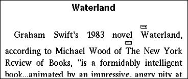
Figure 1: Intermedia link markers
Links are one of the most important means for navigation in the World Wide Web. However, the visualization of and the interaction with Web links have been scarcely explored, although Links have severe implications on the appearance and usability of Web pages and the World Wide Web as such.
This paper presents two studies giving first insights of the effects of link visualization techniques on reading habits and performance. The first user study compares different highlighting techniques for link markers and evaluates their effect on reading performance and user acceptance. The second study examines links-on-demand, links that appear when pressing a dedicated key, and discusses their possible effects on reading and browsing habits.
The findings of the conducted studies imply that the standard appearance of link markers has seriously underestimated effects on the usability of Web pages. They can significantly reduce the readability of the text, and alternatives should be carefully considered for the design of future Web browsers.
Hypermedia, Input Interaction Technologies, Link Marking Techniques, Links-On-Demand, Usability Survey
The World Wide Web is today's largest and most important online information infrastructure. Its interface and structure is determined by the concept of the hyperlink, a directed relationship between two objects. Web hyperlinks usually connect a small phrase, a graphic, or even only a single word with another document in the Web address space.
These links form the primary navigational means of the Web. Studies have shown that following links is the most frequent action when using a Web browser: Catledge and Pitkow reported 52% of user actions clicks on links [10], Tauscher and Greenberg reported a value of 42% [32].
Links were initially intended to establish semantic relationships between related chunks of information. Though the derivation is far from straight, Web hyperlinks are usually seen as originating in Vannevar Bushís historical article "As We May Think" from 1945 [9] and in the conception of nonlinear texts proposed by Ted Nelson in 1974 [23]. According to their visions, links allow the associative transition from one piece of information to another, shaping "paths of thought".
In the Web, however, links are not exclusively used to express semantic associations but also to convey structure. The distinction between associative and structural links can be made both technically and semantically: Associative links connect words or phrases embedded in longer passages of text with other chunks of information that relate to the meaning of the phrases in the starting context. This user interface concept -- clickable words embedded in continuous text -- can be traced back to Shneidermanís embedded menus [16]. Structural links, on the other hand, are usually not embedded in paragraphs but in exposed locations and are used to express and navigate logical structures [1]. Hereby, they usually form patterns, like hierarchies or sequences or lead to landmark pages like the homepage of a site, a search page or an index page, routing the users to other pages [27].
Our observation of current link usage on the Web suggests that many more links are rather of structural than of associative character: most Web pages include navigation areas, often explicitly located in a "navigation bar". E-commerce sites use links mainly to structure groups of articles or initiate actions, e.g. displaying of product descriptions. However, when searching hundred of sites for appropriate documents for our evaluations, we could find only very few pages with extended text passages and a substantial number of embedded associative links. This observation correlates with the research results of Miles-Board, Carr and Hall, who programmatically analyzed over 770,000 randomly selected Web pages for highly linked content passages. Only 576 pages (less than 1â) were found that matched their requirements for Web pages with substantial associatively linked continuous text [20]. The current Web can be characterized as a sparse hypertext [24, p. 114].
The rarity of links indicates that highly linked text may be judged unfavorable by authors and cause readability problems. The basic concept of the associative hyperlink might thus become less usable through an inadequate visualization of link markers. At the same time, enhancements to the Web that extend the simple links seem to have only slow success; as we argue in the next section, restrictions of the existing link visualization standard might hinder this development.
The simplicity of the concepts of the Web is probably one of the factors that helped it to expand and succeed so quickly. However, the limited linking means of the Web -- links have to be embedded, uni-directional and are usually un-typed -- have repeatedly been criticized [7; 8, pp. 39]. In contrast, rich hypertext systems offer sophisticated support for structuring, editing, annotation and navigation. All approaches that try to integrate such extended functionality into the Web have to employ "workarounds" to handle the weaknesses of the simple concepts of the Web.
In the last years, the XML language family, a series of new Web standards, has been introduced to challenge these weaknesses and change the face of the Web from the inside, thus creating new demands for the user interface of web browsers. One of these standards is XML Linking, a W3C recommendation that specifies new hyperlinking facilities for XML documents.
The linking potential of XML linking is based on two key standards, which are necessary to create and describe links and link anchors: An XLink consists of an arbitrary number of resources and arcs. A resource is any addressable unit of information or service, while arcs create directed relations between two resources each [11]. Resource Anchors can be defined using XPointer, which allows addressing different kinds of spans in XML documents [13]. These spans can vary from points to complex regions and can even be distributed over the document, e.g. an XPointer can be used to address a specific string in all citations of an XML file. Thus, XML Linking allows the separation of structure and contents by storing link information in link bases, servers or databases dedicated for the storage of links. It becomes possible for anyone to add links to the read-only material of the Web. Two possible applications of these features are link bases for specific topics or user groups, which can help to improve the navigation on the Web, and personal or workgroup annotation systems. The density of links could be significantly increased when external storage of links becomes possible.
Though annotating printed articles and books is an essential practice for most readers, decent annotation support is still one missing key feature for Web browsers [26]. As current annotation implementations that make use of XPointer [34, 39] insert additional markers that compete for the readerís attention, both discernability of links and readability of linked text become increasingly important.
The XLink standard, allowing for both external link storage and annotation of documents by readers, can lead to a much richer interlinking between documents, and thus to a higher link density within documents. It also significantly increases the chances that the start of one link marker overlaps with the end of another link marker, creating overlapping link markers, since different link authors may choose the same words as part of their link anchors. Furthermore, XPointer makes it more feasible to link large chunks of information, such as paragraphs or tables, to other resources, and the potential to refer to many resources in one XLink allows to define links with multiple destinations.
Another advantage of XML Linking is its extended typing means for hyperlinks. Link types describe the relationship between the source and the destination of a link, often derived from semantic categories like "explanation" or "example" [33]. They were introduced to help users navigate in hypertext by giving them a better idea of the link targets. Streitz et al. list semantic link information as their "first principle of useful hypermedia system design" [31]. XLink defines both machine-readable and human-readable type information that can be specified for the link as a whole, each endpoint of a link and for every arc. Obviously, typed links are only helpful if the user can distinguish the different types. However, most presentation and behavioral aspects of XLinks have been deliberately excluded from the model, and so the realization of a user interface for these concepts does not exist.
In fact, the question of how to visualize link type information in the Web is not new. Although HTML links donít appear to be typed, even early standards, such as HTML 2.0 defined additional anchor attributes to express link relationships more precisely [4]: Web authors can set a link title and use the two attributes rel and rev to set a forward and backward relationship type. HTML 4.0 identifies several of these types as useful like "contents", "subsection", or "alternate" [28]. However, current browsers only support the title attribute and show it in a little popup; no concept for the visualization of the other two attributes has been realized[FTN1].
Looking closer, Web links also have several implicit types: links can be local or lead to an external site, they can control the contents of another frame or window, and they can use different protocols like news, ftp, or e-mail. However, this type of information is hardly visible to the user, a flaw that can cause usability problems [38]. Already the low discriminability of local and external links was found to be problematic as users often do not expect a link to lead to another site [24, pp. 45]. Besides, the two different apparent link types realized in current browsers -- purple links for recently visited pages and blue for unvisited -- already help the user to navigate and avoid visiting the same page again and again [24]. Although this shows that the distinction of different link types is also important for the Web, different link markers types for different link semantics have barely been considered or evaluated.
For all these new concepts and use contexts the current underlined links offer only poor support: Hypertext with a high density of links becomes poorly readable, and overlapping links are hardly realizable, as the beginning and end of link markers cannot be visualized properly. Moreover, there is hardly any support for typed links: except for blue and purple links, no standard exists that allows the discrimination of different link types. The need to develop and evaluate new concepts becomes even more urgent with the arrival of new techniques and higher usability demands; the time for a change in link visualization might have come. Still, there has been little discussion on how the standard user interface of Web links could be altered in modern Web browsers to enable extended hypertext features.
Current link appearance is not only unsuitable for future requirements, it already causes several problems today. Historically, the origin of the blue underlined links lies in Tim Berners-Leeís WWW browser prototype [5] and Marc Andreessenís Mosaic[2]. The reasons for this choice of link marker appearance were of a technical nature: it was simple to implement, and at that time most computers had only either a 16-color or black-and-white display. Blue was the darkest of the available colors, the closest to black text; for monochrome displays, the text was underlined [22]. Although later versions also allowed for different link marker appearances (boxed, double underline, thin underline, no underline) from which any user could pick a favorite one, the standard appearance was adopted by later browsers like Netscape and Internet Explorer. Even today, the blue underlined links prevail, and principal Web design guidelines recommend not changing the appearance of links [17, 24, 30] for the sake of consistency. They confine the length of link markers instead, e.g. Nielsen recommends that link markers should be 3 to 5 words long [24]. This, however, limits the expressiveness of links.
Nevertheless, more and more Web designers style their links, as the standard blue underlined links exceedingly stand out in the text. Furthermore, underlining is known to reduce the readability of text significantly, as it changes the word shape and interferes with descenders, letters that drop below the line like p, q and j [18]. It is a well-established custom in Typography to avoid any underlining and use the more subtle italic and bold typefaces to highlight text instead [14, pp.35]. The point made here is, however, still valid, as the standard appearance of links is unchanged and relatively few authors or readers will take the necessary steps to change the standard underlined links into some more readable alternative.
For marking Links in graphics, the standard employed by Web browsers is even worse: Linked images are framed with a blue line. This method hardly harmonizes with any page design and so most Web authors hide the border. Instead graphics have to be (re-)designed to appear "clickable". The conflict between the illustrative function of an image and its interactive functionality as link also poses problems for image maps. If, for example, a map or chart shall include hyperlinked areas, they have to be specifically designed to confer the presence of a link. A common link standard for text and graphics that could emphasize active regions without the need for specific image alterations would decrease the unnecessary design effort and allow more flexibility for graphical design. It would also help implement links in interactive audiovisual presentations, as described by the W3C standard SMIL[FTN2] [29].
Figure 1: Intermedia link markers
Former hypertext systems used techniques that avoided a change in typographic attributes such as underlining, weight or color to highlight links: One option for marking links are graphic symbols, in the Eighties, IRIS' Intermedia marked hyperlinks with little arrow icons located between lines of text and above graphics, showing the start of the link span but not its endpoint [40]. However, for Web pages this is hardly a feasible standard, as this method occupies extra screen space and inserting additional elements can clutter the page layout.
A more promising method in the context of the Web is the change of the background color as implemented by Hyper-G's browser Harmony [3]. This has the advantage that the typeface and style of the text can be chosen freely, no extra space is needed, and overlapping links become possible (see fig. 2).
Looking closely, link markers are always a design compromise: on the one hand the readability of the text ought to be kept as high as possible; on the other hand the link anchors have to be distinguishable from other text, as users have to interact with links. For highly linked hypertext any way to visualize links can be problematic: "After all, when everything is highlighted, then nothing is really highlighted anyway." [25, p. 114]. Not showing the links could be an alternative. This, however, can also lead to new problems as with the Symbolics Document Examiner [35]: link markers were hidden so well that they were only highlighted when the mouse passed over them. This forced a "hunt and peck" search for active regions.
An alternative are links-on-demand, a technique that was introduced in Storyspace [12]. This system drew boxes around link anchors when the reader pressed particular keys, making links evident on request and thus keeping the text pristine the rest of the time. In fact, this was also the consensus solution after the Hypertext '87 demo sessions, when renowned hypertext designers could first compare all existing systems side by side [6]. However, when using links-on-demand, the interface designer must be aware of a potential disadvantage: since links are not always visible, possibly distracting mode switches have to be applied.
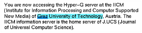
Figure 2: An overlapping link in Harmony
We listed diverse reasons why an alternative for underlined links is needed, either to replace it as a standard, or to allow the customization for different use scenarios. To be able to select the appropriate visualization for links, we must find out more about their intended use. In [37] it was argued that translucent overlays seem to be appropriate from a conceptual point of view: For text, they look like a change of background color, they can be applied to any document without changing the layout and allow overlapping links (Fig. 3). Furthermore, overlays do not interfere with text like underlines, and they can also highlight active regions in graphics and image maps without the need for image redesign. Lastly, they can support different link bases or link types by different colors, and they can emphasize links to different degrees by variations in the intensity of the overlay.
In the first study of this paper, we empirically compared overlay link markers with the standard blue underlines; in a second study, we tried to cast some light on the effects of showing links only on demand and investigate the change in reading habits this might induce.
Our initial research indicated that small variances in the appearance of link markers can theoretically have important effects on the readability of the text. To estimate the extent of these effects, we designed an experiment that could measure the recognition performance of read phrases, as a closely connected measure for the reading performance: The participants were asked to both quickly and thoroughly read text on a Web page within a limited time and thereafter answer questions relating to it. The nature of this task was determined both by the necessity to put the participants under strain, so that they would produce measurable errors, and our intention of recreating a behavior common in Web usage: When searching for information, users often only have little time and read pages only superficially; the first, possibly hastily executed click will make the current page disappear. We assumed that the better the participants could perform the reading task, the better they would recognize the words they had read. To compare performance for both marked links and remaining text, 50% of the questions related to linked phrases and 50% to unlinked phrases.
The participants were presented a series of short texts with 90-220 words (mean 155). Each text had 4 to 10 link phrases of 1 to 8 words (most had 3 words) length, so 7 to 11% of the content was marked as a link. The texts were taken from one of Germanyís most frequented news tickers and stripped of all navigation areas, graphics and commercial advertisements (see Fig. 3). We carefully selected a number of news from 1998 through 2000 that the participants would neither remember nor identify as old news. The text difficulty should be consistent and the content of approximately the same interest to our participant group. Where appropriate, the text was shortened or links were added to match our consistency criteria and to achieve a similar link density. We thus tried to minimize the disturbing factors caused by artificiality and inconsistency of the Web pages as described by [15].
Different visualization techniques for link markers might change the reception of the text in several aspects: First, link markers might draw attention to the phrases highlighted by links, thus making them stand out and improve the recognition performance for questions regarding these phrases. At the same time, this would decrease the overall reading performance and thus word recognition of the unmarked text. Second, the highlighting could also make the linked text less readable and thus decrease the performance for the recognition of linked phrases, especially for underlined text, as discussed before.
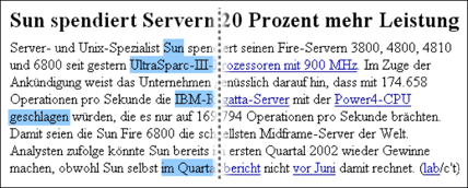
Figure 3: One example text showing overlay link markers (left) and ordinary links (right). Text source: www.heise.de
Two different link visualization techniques were tested against the control condition, text without links (PLAIN). The first visualization (UNDERLINED) used standard blue, underlined links as employed by all mainstream Web browsers. The second technique used a light translucent blue overlay (Fig. 3) highlighting the words of the link anchor (OVERLAY).
We predicted the different visualizations to effect measurable differences in the overall recognition performance: For the PLAIN condition, the participants should perform best, as no distraction from the text was present. Both the OVERLAY and UNDERLINED conditions should perform worse, possibly with a slight edge for the OVERLAY condition, as its markers might be less distracting than the underlined text and have less negative impact on the readability of marked text. This difference should be most clearly visible when questions relating unlinked text were considered; for linked phrases, the OVERLAY and UNDERLINED conditions should yield a similar or better result as the attention of the participant was attracted by the phrases marked as link.
12 participants took part in the test, all being unpaid volunteers and students or staff of the informatics department. The mean age was 25.3 years, two were female. All participants had extensive internet experience and use the Web several times a week. Since we expected the effects of different visualization conditions to be quite large, we chose to test a comparatively small group in this pilot study.
To reduce the influence that different degrees of interest in the test items would have, we selected a very homogeneous user group. The target group consisted of regular and experienced internet users, as we wanted to assess the willingness of these users to adopt changes in the Web interface. Also, familiarity with the Web browser used in the study and the fact that we invited only native speakers of German to participate reduced potential problems not caused by our test tasks.
To minimize variations in the experiment environment, we designed an evaluation tool that both let the participants use the Web browser in a normal fashion and presented them with the questions while allowing the input of answers. The Scone framework [36] was chosen as basis for this tool. Scone supports the development and evaluation of Web enhancements; here it was also used to render the different link visualizations. The test documents were filtered by Sconeís proxy component WBI [19], which added the appropriate style sheets to every page. Scone also provided an easily accessible mechanism to control the browser and to record all navigational actions of the users.
The PC used in the experiment had two 17 inch color monitors with a screen resolution of 1024 x 768. The evaluation software was displayed on the left screen (Fig. 4) while the right screen showed a full screen view of Microsoft© Internet Explorer 6 in standard appearance. The participants were not allowed to change this setup.
Figure 4: The evaluation tool for the first experiment.
The test started with a short introduction of the test setup, including the use of the two screens, and the test procedure, which was in consequence moderated by the evaluation software: The participants were presented with some training tasks and thereafter with three sets of five tasks. The sequence of visualization conditions (PLAIN, UNDERLINED and OVERLAY) was altered between participants, all permutations being tested equally often, while the order of the test documents remained unvaried. A change of link marker visualization was announced by a short message. For each task one of the prepared Web pages was shown for 35 seconds on the right screen; then the screen was automatically blanked and four questions appeared on the left screen. Each question had to be answered by choosing a short phrase via multiple-choice: only one of three offered phrases was included in the text read before. In addition, the participants had to rate the certainty they felt when answering each question on a four-point scale ("very certain", "quite certain", "uncertain", and "guess"). The answers to two of the questions were contained in phrases emphasized by links markers ("marked"), the two others could be found in unmarked text. The experiment thus had a 3x2 design with three different visualization conditions and two types of questions.
In total, the 12 participants read 180 Web pages and answered 720 questions, 240 for each condition. Every single participant read 15 Web pages and answered 60 questions, 20 for each of the three conditions. The participants could thus score between 0 and 20 correct answers for each condition. The mean number of correctly answered questions was 14.1 out of 20 (71%) with a standard deviation of σ=2.4. To reduce the noise introduced by guessing (for every question, one of three possible answers had to be selected), the participantsí rating of their certitude was used to select valid answers: only answers of which the participants were "very certain" or "quite certain" were finally evaluated as correct. With these restrictions, the mean number of correctly answered questions decreased to 10.6 of 20 (53.2%) with σ=3.1.
The recognition performance showed differences for the different visualization conditions (Fig. 5). As predicted, PLAIN text yielded the best results with a mean score of 11.58 out of 20 (57.9%) with σ=2.78. This performance was nearly matched in the OVERLAY condition with a mean score of 11.25 out of 20 (56.3%) with σ=3.33. In the UNDERLINED condition, the participants answered only 9.08 out of 20 answers correctly (45.4%) with σ=2.87.
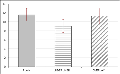
Figure 5 : Mean number of correct answers
A univariate analysis of variance was employed to probe for significant differences in the results. The dependant variable was the number of correct answers, the independent variables were (a) the visualization, and (b) the type of the task (text questions or link questions). Both variables induced a significant difference in the correctness of answers: (a) the visualization p=0.045, F2,22=3.256; (b) task type: p=0.002, F2,36=10.460, marked phrases showed a much better recognition performance. There was no measurable interaction between the variables (p=0.46, F2,5=0.785).
As Leveneís test hinted that the error variance was equal across groups (p=0.633), we first employed a dependant t-test. The results hinted at a significant difference between the PLAIN and UNDERLINED condition (p=0.022, T=2.167 dF=22). This was confirmed by the conservative Scheffe test (p=0.08) on the assumed 10%-niveau. There was no statistical difference between the PLAIN and OVERLAY conditions. The difference between the UNDERLINED and OVERLAY conditions was significant only in the dependant t-test (p=0.046, T=-1.75, dF=22), the Scheffe test showed no statistical difference (p=0.134).
The quantitative data illustrated differences in the recognition performance of the participants in the experiment. To get a broader view of what effect the change in link visualization might have, we collected qualitative data in a semi-structured interview after the test. Before the interview, the subjects were told that the test conductors were not the developers of the evaluated techniques, to avoid well-meaning ratings.
First the participants were asked how readable they rated the text under each visualization condition. On a five point Likert scale from 1 (very good readability) to 5 (very low readability) the PLAIN condition was rated best (mean 1.1, σ=0.378). Both the UNDERLINED (mean 2.6, σ=0.535) and the OVERLAY (2.8, σ=1.165) condition were rated less readable. Noteworthy is the high divergence of answers for the OVERLAY condition: the participants gave every answer from "very good" to "very bad" readability (Fig 6).
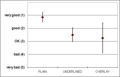
Figure 6 : Readability of the three text conditions
Nearly all participants judged text without markers better to read than text with link markers, except for one who preferred text with overlay markers as "links highlight important facts"; three participants rated all conditions equally readable.
Next, the participants were asked which of the two link marking techniques emphasizes link phrases most. Here only two of the twelve participants chose underlined links, but six participants (50%) voted for the overlays. Several of these participants noted that they found them more conspicuous, as they were "uncommon". Four participants could not rate one method over the other, as they saw advantages and disadvantages in both approaches.
Finally the participants were asked how they liked overlay links compared to underlined links and what characteristics of overlays they saw as advantages or as weaknesses. The judgment for the overlays was very heterogeneous. While almost half of the participants were pleased with the new overlay method, nearly as many participants disliked them and preferred the underlined links (see table 1).
Table 1 : User judgment of overlays
| How do you like the overlays compared to the underlined links? | ||||
|---|---|---|---|---|
| much better | better | same | worse | much worse |
| 1 | 4 | 3 | 2 | 2 |
The advantage most frequently mentioned for overlays was that they were "less disturbing", having "less contrast to the regular text" and therefore preferable for reading text. Two participants found the link presentation "more pleasant". Furthermore, it was mentioned that underlining could again be used to emphasize text. Finally, the similarity to using highlighters on paper was perceived as positive.
In contrast to the opinion above, two participants disliked the overlays for emphasizing links too much and being even more distracting than underlined links. Also criticized was the unfamiliar character of the overlays: one participant disliked their "block-like" appearance, another noted that the overlays might be problematic with colorful pages and a third person found the alteration of the background of the text disrupting.
As expected, this study shows that underlining words in a text affects the recognition performance negatively. The underlined links did reduce the recognition performance for our experienced readers. This could be due to a combination of two effects: (1) the readability is reduced, (2) underlines distract attention from the unmarked text -- especially as our participants were experienced, this could be conditioned behavior. As the underlined links did not yield a better performance when the participants had to recognize linked phrases, any positive effect of the added attention was lost, possibly due to the decreased readability of the underlined link markers.
The new overlay technique worked very well, it outperformed underlined links both overall, and in particular for link phrases. There was no measurable difference in performance between the overlays and plain text. This is remarkable, since plain text was almost unanimously rated best to read by the participants. The assumed performance gain in the OVERLAY condition for linked text did not become significant, although the mean correctness rates could suggest an effect here. This calls for further investigation with a larger number of participants than in this first study. A possible interpretation for better performance of overlay markers would be that the overlays directed attention to the marked text, without having a strong negative effect on its readability.
The observed effect of questions regarding marked vs. unmarked text in all visualization conditions can partly be explained, as link markers were often names of companies or people, which the participants remem-bered well. A further study could systematically vary the linked phrases.
As this is the first study of its kind, careful interpretation is needed. The findings are very much what we expected, and the explanation seems simple, but further studies with a larger number of participants will have to reinforce and differentiate the findings presented here. The observed effects will partly depend on the intensity and color of the overlay -- we chose a rather strong blue for the overlays to give them a distinctiveness comparable to underlined links and reduce the potential effects of different colors. Thus, we may have strengthened the emphasizing effect more than necessary. On the other hand, being able to adjust the strength of the overlays is an important advantage compared to underlining: The emphasizing effect can both be tailored to the userís preferences and his tasks, as well as be fine-tuned to match the design and the layout of a Web page.
Our results indicate that the readability of text with underlined links in Web browsers is impaired. Although our Web pages could be considered sparsely linked, the effects were measurable and supported by the subjective results: all participants preferred text without link markers for reading.
The design implications for the Web are clear: underlined links should not be used when readability of text is the main concern. Overlays could be a superior alternative for link markers. Simple colored text, of which an increasing use can be observed in the World Wide Web, could be a viable alternative. It was not included as a visualization condition, as we expected only small differences to plain black text, that would not have become significant with our small sample of participants. Also, overlay markers have the advantage that they work for both text and graphics.
A degraded readability of hyperlinked text and the strong emphasizing effects of underlined links could add to the reasons for people scanning -- instead of reading -- Web pages. In a study conducted by Morkes and Nielsen, 79% of the participants always scanned Web pages first [21]. This is consistent with our results: ten out of twelve participants described their reading habits on the Web as scanning, glancing over the text and looking primarily at headlines and links. Eight participants preferred a printout for reading.
This fuels doubt if underlined links are an appropriate solution for a digital paper world. In the long run, their weaknesses might have added to the reasons for the scarcity of associative links in the Web. Although there are other reasons for authors not to use associative links (e.g. they are often more difficult to create and maintenance is costly), if underlined links hurt reading performance, they are used sparsely. And, if there are but a few links, there is less need to change the visualization.
But as the effects of link marker visualization on reading will be even stronger when extended linking mechanisms are employed and rich linking becomes more common, a concept is needed to counter the negative effects of hyperlinks and preserve the readability of Web pages. In the second study we thus investigated, whether showing links only on demand would have effects on Web readers.
The first study presents evidence that link marker visualization does have a significant effect on how people read Web pages: readability is decreased when underlined links are added to a Web page. One idea how to reduce the distraction link markers cause when reading a text -- which was in fact already agreed upon as an optimal solution by hypertext experts -- are links-on-demand [6]. This describes a technology where users have to depress a button to make the links visible. We wanted to evaluate whether hiding the links would affect the way people interact with hypertext (i.e. if they would stop scanning over the text), and how this change in behavior would be received. Thus, we did not only collect data as part of a formalized task, but also used an evaluation of qualitative interviews and observation notes.
The study compared the performance impact of links visible only on-demand, i.e., when a user pressed a key [FTN3] (ON-DEMAND), with the typical always visible underlined links (ALWAYS). We designed a set of experimental tasks where the participants were presented a short text with 80-239 words (mean 158.8, σ=41). In this text, from 3 to 11 links (mean 5.9, σ=1.96) pointed to other WWW resources, the links ranged from 1 to 6 words in length (again, most links were 3 words long). The mean ratio of words per link was 27, thus 5 to 10% of the text was marked as a link. The texts were taken from the same news ticker and prepared as described in study one. The hardware and software setup was similar, too.
16 participants took part in the experiment, all unpaid volunteers, being either student or staff of the informatics department. The age of the 16 participants ranged from 21 to 36, with an average of 26.1, three were female. Again, the participants were all native speakers of German with extensive Web experience.
The participants were instructed to find the answer to a given question as fast and as accurately as possible. A button labeled "start" had to be pressed in the test tool to commence a task. Consequently the Web page with the experimental text appeared in the browser on the right screen. The answer to the given question could be found in two ways: Either it was already contained in the text given (TEXT task), or a single link had to be followed and the answer could be found on the next page (LINK task). We created a TEXT and a LINK task for every page. The task types and the link rendering conditions were controlled for all participants, while the order of the test pages remained unchanged. When the participants felt that they had found the answer, they had to press a button labeled "stop" and enter the answer in a text field (Fig. 7).
Figure 7 : The evaluator tool for the second study
Performance was measured by correctness of the answer, time needed to complete the task, and selected links. For the TEXT tasks, the time between pressing the start button and the stop button was rated. For the LINK task, time was measured until the first link had been selected. A TEXT task was answered correctly when the users entered a correct answer and did not select a link. LINK tasks were solved correctly, when the user initially selected the right link. In both conditions, thus, time was gauged only until the relevant information had been found and disturbing factors caused by uncontrolled target pages were minimized. Because the method of measurement differs, however, measurements cannot be compared across conditions.
We expected a change of reading behavior in the ON-DEMAND condition: as links are initially invisible, we assumed the participants would read or scan the text completely before selecting a link. Accordingly, for TEXT tasks we predicted a lower number of erroneously selected links and a faster time to find the answer. However, for the LINK questions we predicted a slower response time, as participants would not be tempted to scan the links first. If the participants failed to find the correct link and instead tried to answer the question without following a link, the number of errors would increase.
The design of the experiment depended on the subjectsí performance in locating information asked in a question. 16 participants had to answer 12 questions each. The mean number of correctly solved tasks was 10.5 of 12 (88%) with a standard deviation of σ=1.46. In total, the subjects read 192 documents, 96 of both conditions. These two conditions consisted of two task types each: 48 LINK tasks and 48 TEXT tasks.
As expected, the participants did make more mistakes when finding desired information in the TEXT tasks while the links were ALWAYS visible (13 errors, 27,1%) compared to the ON-DEMAND condition (6 errors, 12,5%). A chi-square test yielded a 1-sided significance of p=0.0365 (chi2=3.215, dF=1). However, the participants made significantly more mistakes when answering a LINK question in the ON-DEMAND condition: 5 of the 48 tasks (10.4%) were solved incorrectly compared to no errors in the ALWAYS condition (Fig. 8). As the chi-square test could not be used here due to the lack of errors in the ALWAYS condition, Fisherís Exact Test was used; the result had a significance level of p=0.028.
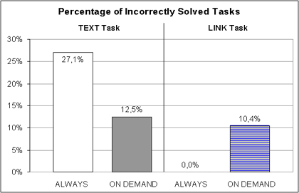
Figure 8 : Comparison of error rates
Comparing the task execution times, the ALWAYS condition showed excellent results: TEXT tasks were answered in similar speed in both conditions: the condition ALWAYS had a mean task completion time of 20.5s (σ=13.4), whereas in the ON-DEMAND condition, users needed 21.2s (σ=13.4). LINK tasks were answered in 18.1s (σ=11.7) in the ALWAYS condition, compared to 23.8s (σ=15.1) for ON-DEMAND links (Fig. 9). A dependant t-test indicated this difference to be significant (p=0.044, t-value= -2.014). The high standard deviation in task completion time was highly affected by interindividual differences in the participantsí reading habits.
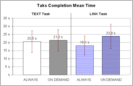
Figure 9 : Comparison of task completion times
Again, the acceptance of this new technique varied extremely (Table 2). Four participants rated links-on-demand "much better", five "better" than underlined blue links. However, five participants liked the new technique less than ordinary links and one judged it to be "much worse". One was uncertain.
Table 2: User judgment for links-on-demand
| How do you like links-on-demand compared to always visible links? |
||||
|---|---|---|---|---|
| much better | better | same | worse | much worse |
| 4 | 5 | 1 | 5 | 1 |
The participants were also asked for their opinion on the advantages and drawbacks of the on-demand technique. 10 of the 16 participants appreciated text without links as more readable and therefore perceived the links-on-demand as less distracting and interfering. Several explanations were given for this positive judgment: Permanently visible links "press" the reader to scan the text and to click on the links without reading the text. The unlinked text appears "steadier" and "less distracted" and it is therefore more motivating to read. Furthermore, hypertext with links on demand looks more like ordinary text. Finally, three participants stated they thought this technique would improve the design of most Web pages a lot, as the links often look "hideous".
On the other hand five participants criticized that the mode switches with the control key were disturbing, as it created an extra effort to press the key and was an unfamiliar extra interaction with the browser. Two participants even found links-on-demand more distracting, as they felt they had to press the key almost continuously to be able to solve the tasks.
Finally, six users stated that the on-demand links were not suitable for the experimental tasks, as they asked for specific information in the text where the highlighted links were often useful (for every LINK task); in reality, links would be usually of less help.
Links-on-demand seem to be a large step away from the hypertext interaction paradigm of the Web. While some users readily embraced this new interaction technique, others showed rejection. Though two users tried to preserve their everyday practice by depressing the key continuously, our quantitative data suggests that an overall change in reading habits was induced:
As we predicted, the ON-DEMAND condition produced less errors for TEXT tasks; in the ALWAYS condition 10 out of 13 errors were caused by quickly selecting a link before reading the whole page.
In contrast, when the participants had to follow links to find the answer, they were more reluctant to do so: 4 out of 5 errors produced for LINK tasks were produced this way. Instead of scanning the text for links and immediately following a link even if it seems only remotely connected to the desired information, the participants often read through the Web page before bringing up the links. This is consistent with the longer time needed for LINK tasks in the ON-DEMAND condition, the extra time needed can also be partly explained by the extra effort of depressing the control key.
Again, we are faced with a trade-off here: while always-visible links allow for fast interaction with links, they inhibit reading the text on the Web page. If a text is to be read completely, it should not contain always-visible links. Most German online-newspapers have apparently realized this and now give a table of links at the end of the text instead of using inline links. Thus, links are used like footnotes in ordinary text. It seems to be worthwhile to consider the use of links-on-demand in such cases.
This paper presented two studies that investigate the effects of different link visualization techniques. We believe that further research is needed in this area, as the perception of and interaction with Web pages is influenced significantly by the look of the links. To our knowledge, no previous studies exist that try to investigate the changes in user behavior induced by link appearance. On the contrary, the choice of current link visualization is quite simplistic and seems almost arbitrary. But, as our studies show, deliberate design is vital, since small changes in appearance can cause both measurable and subjectively noticeable differences in usability.
The first study showed that alternatives to blue, underlined links exist and compare well: Underlined links seem to substantially decrease the reading performance on Web pages and may add to the reasons why users donít like to read on the Web. Translucent overlays did not only avoid the disadvantages of underlined links in our study, they also offer many advantages such as being more flexible, applicable to graphics and ready for future requirements like those that will be introduced by the W3Cís XML linking standard and other rich hypermedia concepts.
Both literature [21] and our participants state that reading on the Web can often be described as "scanning" for links. We believed that this behavior might be connected to the fact that links are very apparent in current Web pages and excessively attract the attention of the users. To try an alternative, we investigated the effects of showing links only on-demand. The second study proved that the interaction of users can change fundamentally if links are not always displayed: both the measured results and our observations indicated that users did mostly not scan the texts for links but started reading when links were initially hidden. The demonstrated trade-off will have to be considered when Web pages are designed to be either quickly scannable or easily readable.
The availability of better link visualization concepts, the change in reading behavior and the unexpected readiness most participants displayed in trying out the new interaction approaches show that the existing blue-underlined link standard does not suffice. The effected distraction might be part of the reason for the bad readability of Web pages; it might even cause problems for the user, as underlined hyperlinks have less than optimal readability, and navigational targets might not be immediately discernable.
Moreover, as tasks are diverse and user needs change for different tasks, a single standard for link markers can not meet the requirements of all users. For some, consistency will rule out all other considerations; for others, an adaptive link visualization strategy might be preferable. A wide variety of tasks could also be supported by the use of overlays that provide for link markers in both text and graphics and can be adjusted in intensity to fit the taskís needs. Link style-sheets could be introduced to style the appearance of certain types of links individually for both users and authors of links.
We would like to thank Horst Oberquelle and Winfried Lamersdorf for their generous support, and our colleagues at Hamburg and elsewhere for their ideas and criticism. Also, we would like to thank all participants for their patience and their comments.
[1] Allan, J.: Automatic Hypertext Link Typing. Proc. of the 7th ACM Conference on Hypertext, 1996.
[2] Andreessen, M.: NCSA Mosaic Technical Summary. NCSA, University of Illinois, 1993. ftp://ftp.ncsa.uiuc.edu/Web/Mosaic/Papers/mosaic.ps.Z
[3] Andrews, K.: Browsing, Building, and Beholding Cyberspace, New Approaches to the Navigation, Construction, and Visualisation of Hypermedia on the Internet, Ph.D. Thesis, Graz University of Technology, 1996. ftp://ftp.iicm.tu-graz.ac.at/pub/keith/phd/
[4] Berners-Lee, T. and Connolly, D. (Eds.): HTML 2.0
Specification: The Anchor-Element. W3C, 1995.
http://www.w3.org/MarkUp/html-spec/html-spec_5.html
[5] Berners-Lee, T.: The WorldWideWeb browser, 1990.
http://www.w3.org/People/Berners-Lee/WorldWideWeb.html
[6] Bernstein, M.: HypertextNow: Showing Links, Eastgate Systems, 1996. http://www.eastgate.com/HypertextNow/archives/ShowingLinks.html
[7] Bieber, M., Vitali, F., Ashman, H., Balasubramaniam, V. and Oinas-Kukkonen, H.: Fourth Generation Hypermedia: Some Missing Links for the World Wide Web. Int. J. of Human-Computer Studies, Vol. 47 (1), pp. 31-65, 1997.
[8] Bouvin, N.O.: Augmenting the Web through Open Hypermedia. Ph.D. Thesis, Department of Computer Science, Aarhus University, Denmark, Nov. 2000
[9] Bush, V.: As We May Think. The Atlantic Monthly. July 1945. Reprinted in Interactions, Vol. III.2, 1996.
[10] Catledge, L. D. and Pitkow, J. E.: Characterizing Browsing Strategies in the World-Wide-Web. Computer Networks and ISDN Systems 27(6), pp. 1065-1073, 1995.
[11] DeRose, D., Maler, E. and Orchard, D. (eds.): XML Linking Language (XLink), W3C Recommendation, June 2001. http://www.w3.org/TR/xlink
[12] Eastgate Systems: Storyspace hypertext writing environment for Macintosh computers, 1991.
[13] Grosso, P., Maler, E., Marsh, J. and Walsh, N. (eds.): XPointer Framework, W3C Working Draft, July 2002, http://www.w3.org/TR/xptr-framework/
[14] Gulbins, J., Kaufmann, C.: Mut zur Typographie, Springer, Berlin, 1993.
[15] Kaasten, S., Greenberg, S., Edwards, C.: How People Recognize Previously seen Web Pages from Titles, URLs and Thumbnails. Report 2001-692-15; Dept. of Computer Science, Univ. of Calgary, Alberta, Canada, 2001.
[16] Koved, L. and Shneiderman, B.: Embedded menus: selecting items in context. Communications of the ACM, 29, pp. 312-318, 1986.
[17] Lynch, P.J. and Horton, S.: Web Style Guide: Basic Design Principles for Creating Web Sites, Yale Univ. Print, 1999.
[18] Lythgoe, J.N.: The Ecology of Vision, Oxford University Press, Oxford, 1979.
[19] Maglio, P., Barrett, R.: Intermediaries Personalize Information Streams. Communications of the ACM, Vol. 43(8), pp. 96-101, August 2000.
[20] Miles-Board, T., Carr, L., Hall, W.: Looking for Linking: Associative Links on the Web. In: Proc. of Hypertextí02, ACM Press, pp. 76-77, 2002.
[21] Morkes, J., Nielsen, J.: Concise, SCANNABLE, and Objective: How to Write for the Web, 29thSept. 2000. http://www.useit.com/papers/webwriting/writing.html
[22] NCSA: Mosaic(tm) for MS Windows User Guide, National Center for Supercomputing Applications, University of Illinois, 1996. http://www.ncsa.uiuc.edu/SDG/Software/mosaic-w/releaseinfo/2.1/index.html
[23] Nelson, T. H.: Computer Lib/Dream Machines, Mindful Press, 1974.
[24] Nielsen, J.: Designing Web Usability: The Practice of Simplicity. New Riders, Indianapolis, 2000.
[25] Nielsen, J.: Hypertext and Hypermedia, Academic Press, 1993.
[26] O'Hara, K., and Sellen, A.: A comparison of reading paper and on-line documents. Proc. of the ACM SIGCHI Conf. on Human Factors in Computing Systems, 1997.
[27] Pirolli, P., Pitkow, J. et al.: Silk from a Sow's Ear: Extracting Usable Structures from the Web. Proc. of ACM SIGCHI Conf. on Human Factors in Computing Systems, Vancouver, Canada, 1996.
[28] Raggett, D., Le Hors, A. and Jacobs, I. (Eds.): HTML 4.0 specification. W3C, 1998.
[29] Rutledge, L., Schmitz, P.: Improving Media Fragment Integration in Emerging Web Formats. In: Proc. of Multimedia Modeling 2001 (MMM01), Amsterdam, NL, pp. 147-166, 2001.
[30] Spool, J., Scanlon, T., Schroeder, W., Snyder, C., DeAngelo, T.: Web Site Usability: A Designerís Guide. Morgan Kaufmann Publishers, 1999.
[31] Streitz, N., Haake, J., Hannemann, J., Lemke, A., Schuler, W., Schütt, H., Thüring, M.: SEPIA: A Cooperative Hypermedia Authoring Environment, Proc. of the 4th ACM Hypertext Conference Proc. (ECHT'92), Milan, Italy, pp. 11-22, 1992.
[32] Tauscher, L. and Greenberg, S.: How People Revisit Web Pages: Empirical Findings and Implications for the Design of History Systems. In Int. J. of Human-Computer Studies 47(1), pp. 97-137, 1997.
[33] Trigg, R.: A Network-Based Approach to Text Handling for the Online Scientific Community, Ph.D. Thesis, Dept. of Computer Science, Univ. of Maryland, 1983.
[34] Vatton, I., Kahan, J., Carcone, L. and Quint, V.: Amaya: The W3C Editor/Browser, 1996-2003. http://www.w3.org/Amaya/
[35] Walker, J. H.: Document Examiner: Delivery Interfaces for Hypertext Documents, Proc. of ACM Hypertext '87 Conference, Chapel Hill, USA, pp. 307-323, 1987.
[36] Weinreich, H., Buchmann, V. and Lamersdorf, W.: Scone: Ein Framework zur evaluativen Realisierung von Erweiterungen des Webs. In Proc. of KiVS, Springer, Berlin Heidelberg, 2003.
[37] Weinreich, H., Obendorf, H. and Lamersdorf, W.: The look of the link - Concepts for the User Interface of Extended Hyperlinks. In Proc. of the ACM Hypertext 2001 Conference, Aarhus, Denmark, pp. 19-28, 2001.
[38] Weinreich, H., Lamersdorf, W.: Concepts for Improved Visualization of Web Link Attributes. Computer Networks, 33, pp. 403-416, 2000.
[39] Wilson, M., Daniels, D. and Philips, J.: Annozilla -- Annotea on Mozilla, 2003. http://annozilla.mozdev.org/
[40] Yankelovich, N., Haan, J. B., Meyrowitz, N. K. and Drucker, S. M.: Intermedia: The Concept and the Construction of a Seamless Information Environment, IEEE Computer, Vol. 21 (1), pp. 81-96, 1988.
[FTN1] On the contrary, they are usually used for technical concepts, e.g. to include style sheets or to "prefetch" objects as realized in the Mozilla browser from version 1.2 onwards (see: http://www.mozilla.org/projects/netlib/)
[FTN2] The World Wide Web Consortiumís specification of SMIL, the "Synchronized Multimedia Integration Language" can be found at http://www.w3.org/TR/smil20/
[FTN3] In this study the control key of the PC keyboard was used, as it does not have effects on clicks on links.
Copyright is held by the author/owner(s).
WWW2003, May 20-24, 2003, Budapest, Hungary.
ACM 1-58113-680-3/03/0005.