note: the information below represents my very personal opinion. this is not an official policy of our university.
many authors who start to publish on the web ask themselves: what is a good web page ? what is a good design ? as a webmaster of the ETH zürich, i get questions like that every now and then. and many times i'm involved in discussions about what is good on a web page and what is bad. this is one reason, why i started to think about this subject. and i'm trying to publish on the web too, this is another reason. but the most important reason is the fact, that i see lots of pages on the web created by so called professionals which use technics that i consider bad habits.
before i continue, i'd like to state one thing clear: i'm not talking about personal web pages here. on a personal web page, a person shall be able to publish the way she or he wants. but documents on a commercial or otherwise professional web site should fullfil some requirements on one hand and should avoid some bad habits on the other hand.
i'd like to explain this in greater details below.
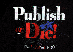
i think this is quite straight forward. the current HTML standard is available from the web server of the W3C. common HTML editor produce code that is more or less compliant to this standard. in my opinion, HoTMetaL Pro from SoftQuad is currently the editor which creates the most compatible HTML documents. this is mainly true, because SoftQuad heavily participates in the W3C and is one of the driving forces within the HTML standardization process.
| to the table of contents |
i'm convinced that content is much more important than appearance. the most beautiful web page doesn't help if the content is incorrect or out dated. there are two very good examples for this:
| to the table of contents |
this is a difficult one, especially for the professionals who used to work with paper. these authors are used to design a layout on a piece of paper and it will be printed exactly the way she or he had in mind. the web is different ! with web publishing, the challenge is to design documents which look great on any screen, regardless of wether it is a 10.2 inch notebook or a 21 inch monitor of a high tech workstation. even worse, the websurfer may choose to use the whole screen or only a portion of it. so the window may be as small as 100 pixels or as wide as 1680 pixels. this is one reason why an author should avoid tables with absolute widths or fonts with absolute sizes (see never use absolute values in pixels). also colors appear very different from one screen to another, therefore an author should also avoid to use fixed color schemes. in addition, some people suffer from not seeing all colors and therefore may have chosen a particular color setting for their browser. if the author overwrites these settings, part of or even the whole text might become unreadable for this person (see never set the font style, size or color for the whole document or paragraph).
| to the table of contents |
this is probably the most obvious recommendation and mainly mentioned for completeness. as a reader, one would like to know when a particular document was updates last - so one can guess how accurate the information might be. and one would like to know who wrote it - so one can send comments or suggestions to the author if one wishes to do so. therefore an email address is the most convenient information.
| to the table of contents |
in my opinion, this is probably the worst thing an author can do at all. these are the reasons:
the only exception that i think i can agree with, is a company logo.
there is a simple but efficient test of a web page: use a non-graphical browser such as lynx or turn of the pictures in your graphical browser and check if you still can see the important information and if you still can navigate through your web site. if both is true, then the design of your web page can't be too bad ...
| to the table of contents |
the use of absolute values in pixels is typical behavior of the paper guys. they take every effort to make a page appear exactly the way they have in mind. this is bad because it does not scale with the size of the screen. if the page is designed to fit on a 480x640 pixel screen and the web surfer has a 1260x1680 pixel screen, the page may stick to the upper left corner and the rest of the screen is unused. or the page uses only the left side of the
screen and the reader has to scroll down even if the whole page would fit on the screen if only no fixed values had been used.
on the other hand, if the pages was designed for a screen that is wider than the web surfer's screen, then she or he has to scroll horizontally to see all the information, which is very annoying too.
a better practice is to use values in percentages. this allows the designer to assign a relative portion of the screen regardless of it's absolute size. in my opinion, the designer of a web page should accept the fact that such a document looks different on different screens. the challenge is to create a design, which looks good on any screen, regardless of it's size.
| to the table of contents |
this is somehow similar to the previous topic. the reason why an author may choose a particular font style, size or color is usually to have full control over the layout of the document. and it is bad because the web surfer may have difficulties to read the document if the font is too small - particularly for a person with bad eyesight - or even invisible, for example for a person who can't see colors. in addition, fixed font sizes do not scale. the
web surfer can choose her or his preferred font and color settings within the browser and authors of web documents should respect these settings by not enforcing their own preferences.
again, instead of absolute values, relative values should be used, e.g. <FONT SIZE="+1">. and i must admit that i sometimes use colors to highlight a word, but this is bad habit too, because it may happen that a person cannot read that word because she or he can't see that color.
the only reasonable way to set these attributes are cascading style sheets (CSS). this is ok because the web surfer can overwrite the settings in the document with her or his own style sheet. unfortunately, style sheets are not yet fully supported by all browsers, but this will probably change soon.
related to this topic are background colors and background images. both are well suited to support corporate identity (a common look of all web pages), but both can decrease the readability of a document. similar colors for text and background may look great on high quality screens, but may be unreadable on notebooks or screens which support less colors. if an author chooses a background image, it should be checked on various types of screens and platforms.
| to the table of contents |
even though everybody knows it and most people agree with it, many (commercial) web sites do it: they decorate their web pages with docents of pictures which slow down the data transfer enormously. i think there is nothing wrong with a logo or one nice picture on a web document, but do we really need ten or more ? i have seen a number of good practices to avoid too many pictures, e.g.:
in addition, i would suggest to use simple icons and graphics instead of photo realistic pictures. this is another challenge for the artists: create icons and other graphical representations that are well suited for computer screens. photographs are usually badly suited for screens, especially if they show lots of details. of course, if the author wants to show or sell a particular product, there is nothing wrong with a picture of that product. what i dislike are pictures on web pages which are there only for decoration, which add nothing but more data that needs to be transferred.
some authors add animated GIFs to get more attention. animated GIFs are a number of images - or part of it - joined together in one file and displayed in sequence by the browser. the advantage of animated GIFs is the fact, that one can have moving pictures without the need of additional software on the client side (compared to quicktime moves etc.). on the other hand, animated GIFs add a lot to the load of the network and may cause some activities on the hard disk of the client. in my opinion, there is nothing wrong with a small animated GIF, but i know a lot of web surfers who feel distracted by the motion on the screen. if an author uses animated GIFs, she or he should make sure that they use the delay option between the images to control the speed. without the delay specified, animated GIFs may execute much too fast on powerful client computers.
| to the table of contents |
one thing i really dislike are these "under construction" notes or signs. especially if the last modification date is back two years, this leaves a very bad impression. it is obvious that most web pages will change over time.
another bad practice i encounter every now and then are links that lead to "under construction" or "not yet implemented" pages. if the page isn't there, don't set up a link - or at least hide the link behind a comment.
| to the table of contents |
in my opinion, italic fonts are badly suited for computer screens. they are hard to read and should be avoided whenever possible. the <EM> tag usually translates to italic, whereas <STRONG> translates to bold. therefore i suggest to use <STRONG> rather than <EM>.
| to the table of contents |
when an author starts to create web documents, she or he should
| to the table of contents |
i must admit that i haven't used frames so far and that i dislike most web sites which deploy frames. but on the other hand, i have seen a couple of implementations with frames which did not look that bad. one disadvantage of frames is the fact that the URL is not obvious. this may become a problem if a web surfer would like to comment on a particular page or if an author wishes to reference the content of a particular frame rather than the "main" document. also, if frames are not implemented properly, new documents may appear within a frame instead of the complete window of the browser.
| to the table of contents |
if you have any comments regarding web publishing, please do not hesitate to send me email.
| to my homepage |
this page is valid HTML 4.01 transitional |