D. Bachiochi, M. Berstene, E. Chouinard, N. Conlan,
M. Danchak, T. Furey, C. Neligon and D. Way
Rensselaer Polytechnic Institute
Troy, NY 12180-3590, USA
Aetna, Inc
Hartford, CT 06156, USA
danchm@rpi.edu, berstenemc@aetna.com
Web designers are constantly searching for ways to improve their works. Recently published books provide such recommendations, but their quality varies greatly. This paper describes how usability testing was used to validate design recommendations. The results show a need for navigational aids that are related to the particular Web site and located beneath the Browser buttons. Furthermore, usability criteria were established that limit page changes to 4 and search times to 60 seconds for information retrieval.
|
Introduction Wayfinding is defined as the "purposeful, oriented movement during navigation" [Darken96]. There are four basic questions one must ask when traversing the peaks of the Grand Tetons, the caverns of New York City or the wonders of the World Wide Web: Where am I? Navigation is then the process of determining a path to be traveled through the chosen environment [Darken93]. In other words, navigation addresses the question of "Where do I want to go?". Much of the current wayfinding research literature deals with virtual reality. However, the Web will quickly become a major focus of wayfinding research as users become more frustrated with poor designs. Many users do not see a navigational problem with the Web. They are content with the features provided by the Browser, such as "Back" and "Forward", and the hypertext links found within Web sites to get where they want to go. Browser navigational aids are particularly misunderstood, even by experienced and sophisticated users. A recent study [Jones96] showed that computer scientists do not recognize the fact that browser historical lists are based on a pushdown stack concept rather than a temporal list. As a result, users end up at surprise locations. This is not a problem if you have time to waste. After all, "surfing" is a pasttime. As the Web matures, particularly the Intranet, user efficiency will become more of an issue. Nielsen [Nielsen95] points out the problems of navigating large spaces with hypertext links. This study concentrates on the navigational aids, provided by the Web site designer, that complement the browser functionality. Inter-Web site maneuvering is typically done via the browser, intra-Web site maneuvering must be the responsibility of the designer. We call this "structural wayfinding" since it is predicated on the structure of the Web site, not the content.
|
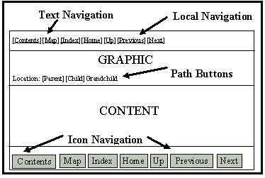
2. BackgroundA number of good design guidelines have become available in the recent months. William Horton, et al's book entitled "The Web Page Design Cookbook" [Horton96] is an excellent reference and contains very specific recommendations on structural wayfinding. They present a generic Web page design and advocate using text and icon navigation buttons as well as path buttons to make life easier. These navigational aids are abstracted in Figure 1. Clicking on these buttons takes you to different places in the Web site organization or structure.
Generic Page Design Horton's navigation buttons comprise seven functions: Content, Map, Index, Home, Up, Previous and Next. We grouped the last three together and called them local navigation buttons. These three allow you to maneuver within the Web site structure based on your current position. A defined hierarchy or organization is very important to this design. "Up" takes you one level up in the site hierarchy. "Previous" takes you to the Web page that resides to the left of the current page in the organization, whereas "Next" takes you to the page to the right. The remaining four functions take you to a specific page in the organization. "Contents" accesses a Web page that resembles a table of contents for the Web site. Hierarchical organization is shown using indentation, much like a textbook. Hypertext links allow the user to go to the desired page directly from this table of contents. The "Map" page is a graphical representation of the table of contents; it shows the structural layout using spatial relationships and each page can be accessed from the map. The "Index" function presents a list of words in alphabetical order, again similar to a textbook, linked to their occurrence in the site. Finnaly, the "Home" function takes the user to the homepage of the particular Web site. Taken together, these four buttons provide a powerful and complementary navigational scheme that appeals to different users. This appeal is extended to the form of the buttons at the top and bottom of each Web page. Text is used to represent the functions at the top of the page. This provides functionality without interfering with the Web site graphics. Icons are used at the bottom of the page to provide redundancy and another representational scheme for diverse users. The Path buttons provide an alternate means of traversing vertically in the hierarchy. As one progresses down the hierarchy, a link label for the page just departed is added to list. One can move up one page in the hierarchy using the "Up" button or the link in the path button list. Path buttons also allow you to jump more than one level by merely clicking the page link label and to maintain an orientation relative to the site hierarchy. As with many guidelines, one is never sure if the recommendations given are based on research, experience, or merely author preference. The authors of this book have excellent reputations, but research evidence was lacking. The recommendations were very logical and attractive, but needed validation through formal testing. Not that testing must be done on everything- but certainly on major points that affect user efficiency. A lost user is one who will never return to an Internet Web site or who wastes valuable time on an intranet site.
|
3. TestingTo validate the recommendations discussed in the previous section, we used Aetna's Usability Laboratory and employees from that company as evaluators. The Laboratory is state-of-the- art, incorporating multiple TV cameras, recording devices and observation areas. Since the questions being asked were important to Aetna's corporate-wide Web page design effort, we configured the test room to emulate conditions normally found in an Aetna workspace. This included a 486 processor with VGA display and Netscape Navigator 2.0.2. The test Web site consisted of 45 separate pages, with a hierarchical structure, and was located on a remote file server. This was done to optimize access and concentrate on the actual navigational features of the design. The test was conducted in two phases. Each phase consisted of an explanation of the navigational aids available, an opportunity for the evaluators to explore the Web site using these features, and then actual testing using a series of questions related to the Web site. In some instances the answers to these questions were found on a single page and others required synthesis of information from a number of pages. Time to locate and answer each question was recorded, as was the number of page changes required to find that answer. Debriefing sessions solicited comments from each evaluator in each phase.The original intent was to test the navigational concepts on the test Web site (Phase 1) and then apply the results to an existing Aetna Web site (Phase 2) for a before and after test. This plan was abandoned during Phase 1 for a number of reasons, most importantly the lack of a completed Web site that was sufficiently complex to adequately test the concepts. Thus, the basic Web site was used in both phases, but some redesign of pages and navigational features occurred between the two phases.
|
4. Phase 1 DesignIn the first Phase we wanted to look at specific aspects of the navigational aids; individual aids, placement and format of aids, and finally the appropriate combinations of these aids. Three different tasks were devised, each looking at one of these issues, as shown in Table 1. In this Phase, all Browser functions were disabled. |
|
Table 1. Phase 1 Test Conditions
|
|
Task 1 dealt with the individual buttons. One group of evaluators was just given Local Navigation buttons plus a "Home" button. They served as the basic control. For the second group we added Structure Buttons to the four just mentioned, whereas Path buttons were added for the third group. The next task looked at placement and form of navigation buttons. Each group had Structure and Local Navigation buttons as well as Path Buttons. However, the Structure + Local Navigation buttons were placed at either the top or bottom of each page and were represented using either text or icons. The last task included all forms of buttons and varied the combinations, as shown in Table 1. The design of Phase 1 required at least 24 evaluators, so as to have 6 evaluators per variable condition (25 evaluators actually took part in this phase). The evaluators were drawn from the general Aetna employee population and basically reflected that mix. Most were over thirty years of age and female, had worked at Aetna for more than five years, had used computers more than ten hours per week and had logged onto the Web once a day. 4.1 Phase 1 ResultsNo statistically significant results were found in this phase relative to time or number of page changes. However, evaluator comments were especially rich in problems and ideas. The lessons learned can be summarized as follows:
These results provided a starting point for Phase 2. There were still some unanswered questions concerning Local Navigation and Path buttons, placement of Structure buttons, and the interaction of Web site navigational aids with browser functions. These were addressed in the next phase. |
4.2 Phase 2 DesignGiven these results, we designed another test to look at two distinct issues: the value of Structure buttons and fixing the buttons at the top near the browser buttons. Table 2 summarizes the design of this Phase. |
|
|
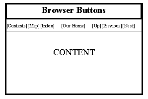
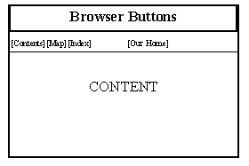
The control condition was the standard browser button configuration plus a "Home" link at the bottom of each page. The second condition basically repeated the recommendations of Horton, et al [Horton96]. The last condition used text navigation aids fixed at the top, as shown in Figure 2. By fixed, we mean that these buttons remain in the same physical location even when the user scrolls the Web page. The only way to do this currently is by creating an HTML frame for the buttons and another frame for the rest of the Web page. Path buttons were not included in the last condition. We also redesigned the map to provide a detailed, but graphical, view of the Web site. This was available in both conditions two and three.
Figure 2. Fixed structure buttons Fifteen new evaluators were recruited from the Aetna employee population. Fourteen were over thirty years of age; 11 were female; all had more than 5 years experience at Aetna and used computers more than ten hours per day, but only five logged onto the Web once a day. Eight of the remaining evaluators had no Web experience whatsoever. A real testing opportunity! 5.1 Phase 2 ResultsTable 3 summarizes the performance measures for this phase. Significant statistical |
|
Table 3. Phase 2 performance measures
|
|
differences were found between Conditions 1 and both Conditions 2 and 3 relative to the number of page changes. Further analysis of the data indicated that this difference was attributed to novice users only. We concluded that navigational aids definitely enhanced performance for novices, precisely the pool of users we are trying to attract to the Web site. No statistical significance exists for the measured times. Although the averages appear to be very different, the variability (i.e. the standard deviation) of performance of evaluators affects the statistical results. Variability was very large for Condition 1 (55 seconds), less so for Condition 2 (41 seconds) and low (9 seconds) for Condition 3. The large variability for Condition 1 dominated the other results. These results tell us that Condition 1 evaluators were very inconsistent while Condition 3 evaluators were very consistent in performance. A substantial finding itself!
6. RecommendationsFigure 3 illustrates the generic page layout that resulted from this usability study. We can summarize by saying that:
Browser tools are not sufficient for effective searching. They must be augmented with: To efficiently find information, users should not have to:
Figure 3. Recommended navigation aids These results show how usability studies can not only validate or invalidate recommendations, but can also drive the design. Web designers are crying for help in establishing good designs. The quality of the help available varies and each must be validated through testing. If the author's recommendations were not validated, designers should be aware of that fact and use the recommendations accordingly. This study validates some ideas, invalidates others, generates new validated design ideas, and provides a usability measure with which to test subsequent designs. Hopefully we can further reduce the time and effort it takes for users to find information on the World Wide Web.
|
| References | ||
| [Darken93] | Darken, R. P. and Siebert, J. L., "A Toolset for Navigation in Virtual Environments", UIST'93 Proceedings, p. 157. | |
|
[Darken96] | Darken, R. P. and Siebert, J. L., "Wayfinding Strategies and Behaviors in Large Virtual Worlds", SIGCHI '96 Proceedings, p. 142. | |
|
[Horton96] |
Horton, W., Taylor, L., Ignacio, A., Hoft, N. L., The Web Page Design Cookbook, John Wiley & Sons, 1996 | |
|
[Jones96] |
Jones, S. and Cockburn, A., "A Study of Navigational Support Provided by Two World Wide Web Browsing Applications, Hypertext'96, p. 161 | |
|
[Nielsen95] |
Nielsen, J. Multimedia and Hypertext, The Internet Beyond, AP Professional, 1995 1 | |